
5 Easy Ways to Improve the Look of Your Resume
Hunting for a new job can be stressful, and creating your resume can prove to be one of the most daunting tasks involved in the process. Chances are, your resume will play an integral role in determining your likelihood of landing an interview for your next big gig. While the content of your resume will be at the forefront of employers’ minds, having a stylish and professional-looking resume will help you stand out in a sea of other applicants. With the help of our professional designers here at SUN, we’ve put together a list of ways you can make your resume look as stellar as we know you are!

1. Add a professional photo of yourself
Put a face to the name by inserting a photo of yourself on your resume! Adding a photo to your resume is a great way to show off your individual personality and professional appearance. This personal touch gives employers a glance at the real-life human being they are interacting with as they read your resume. We should note that to make a good impression, you shouldn’t add just any old photo of yourself. Make sure your photo is of good quality with nice lighting. Sorry selfies, you’re not welcome here!

2. Pair complementary fonts
A professional looking resume always uses good typography. Fonts should be easily legible as employers glance over your resume. Step up your resume game by paring 2-3 different font styles. You could pair a thin, modern-looking font with an elegant hand-written script, or chunky bold headline with a timeless serif-style typeface. The options are endless! Looking for inspiration on how to pair fonts? Check out this board on Pinterest for some great examples!

3. Add color
The world is in more than just black an white, so your resume should be too! You could create a colorful masterpiece, or add the simple pop of an accent color. Make sure to keep your personality and desired job position in mind when choosing colors for your resume. For example, it may be more appropriate to use bold colors for creative positions like photographers and designers, and neutral tones for more serious-style professions like accounting and IT. Also, if you choose to use more than one color, make sure the colors you’ve selected complement rather than clash with one another.

4. visually section off information
Chances are, the person reading your resume will be looking for specific pieces of information to make sure you meet the criteria for the position. Sectioning off your resume into visually appropriate areas will help the reader find exactly what they are looking for as quickly and efficiently as possible. You don’t want them to get lost in your resume and simply move on to the next one because they couldn’t find what they were looking for. Design elements that can be utilized for this purpose include horizontal and vertical lines, columns, color blocks, and margins/white space.
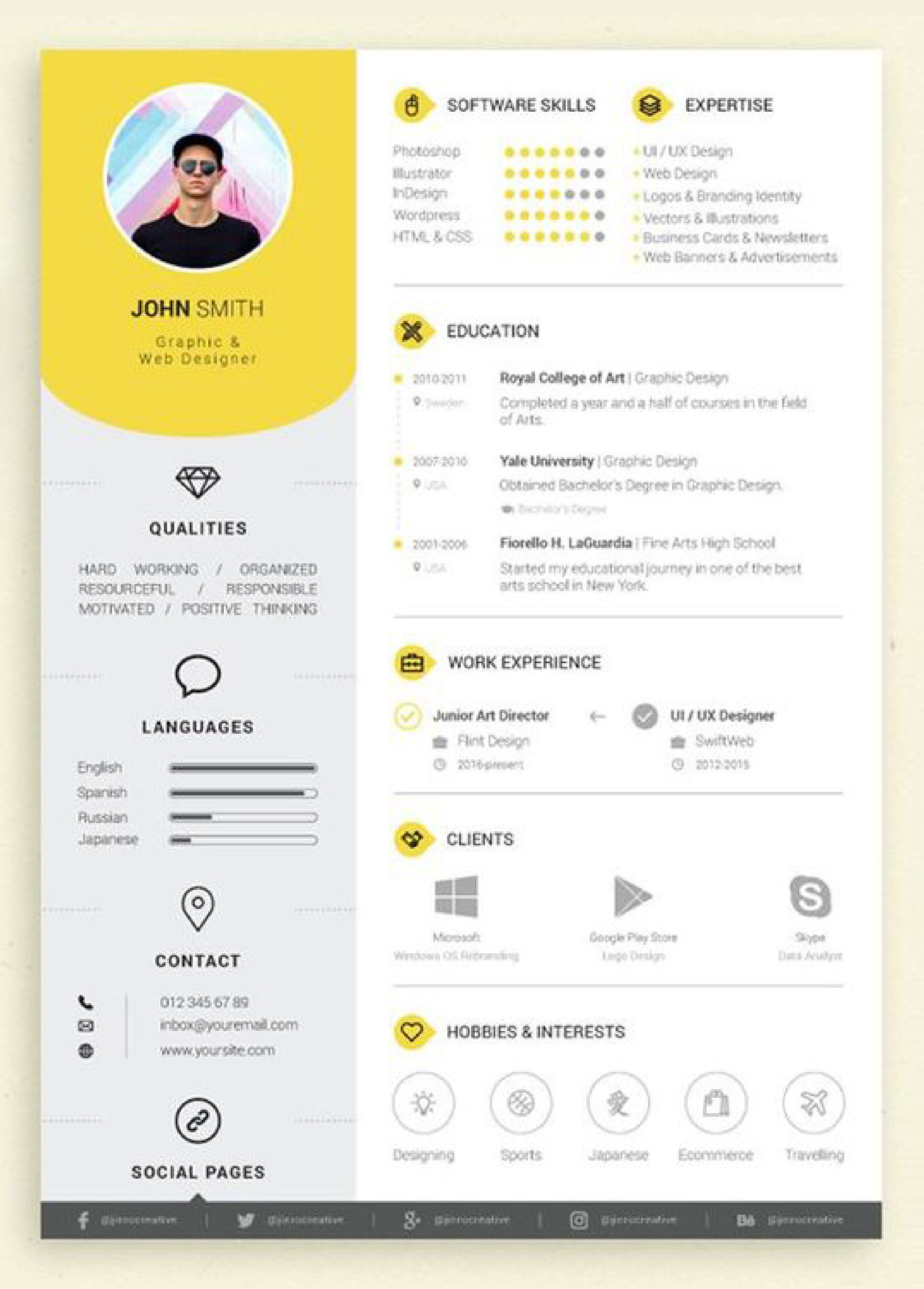
5. utilize icons or graphics to display information
Break up a word-heavy resume by using icons or graphics to present data. For example, many people use graphs or charts to visually represent their skill level in certain areas. Others use icons to represent the different sections of their resume. For example, you could place a graduation hat next to your educational background, or a telephone next to your contact information. Use your best judgement when working with these type of graphics; these elements should work to complement the appearance or enhance the overall comprehension of your resume. If they don’t do either of these things, then it is best to forego this option.
And there you have it folks, 5 easy ways to enhance the appearance of your resume. Have a comment or suggestion related to this topic? Leave it below. Happy job hunting!