
Opacity vs. Tint - Understanding the Difference
In the realm of design, the interplay between visual elements holds the key to creating captivating compositions. Two such elements, opacity and tint, are great tools that wield influence over design aesthetic but oftentimes get confused with one another. In this article, the experts at SUN will delve into the distinctive attributes of opacity and tint, deciphering their roles, applications, and impact, particularly in the context of design and print.

What Is Opacity?
Opacity is the level of transparency, or opaqueness, of an object. Elements with 100% opacity are completely solid, meaning they cannot be seen through. As opacity is reduced, the more translucent an element becomes, allowing objects in the background to show through. For a visual representation, check out our opacity level chart.
Uses of opacity in design: In design, opacity is commonly used in layered elements where the intention is to create a semi-transparent object that allows for a glimpse of other content underneath. Additionally, opacity can establish a visual hierarchy, so opaque background elements don’t distract from primary content. When it comes to web design, opacity can be used to create hover effects and other interactive elements.
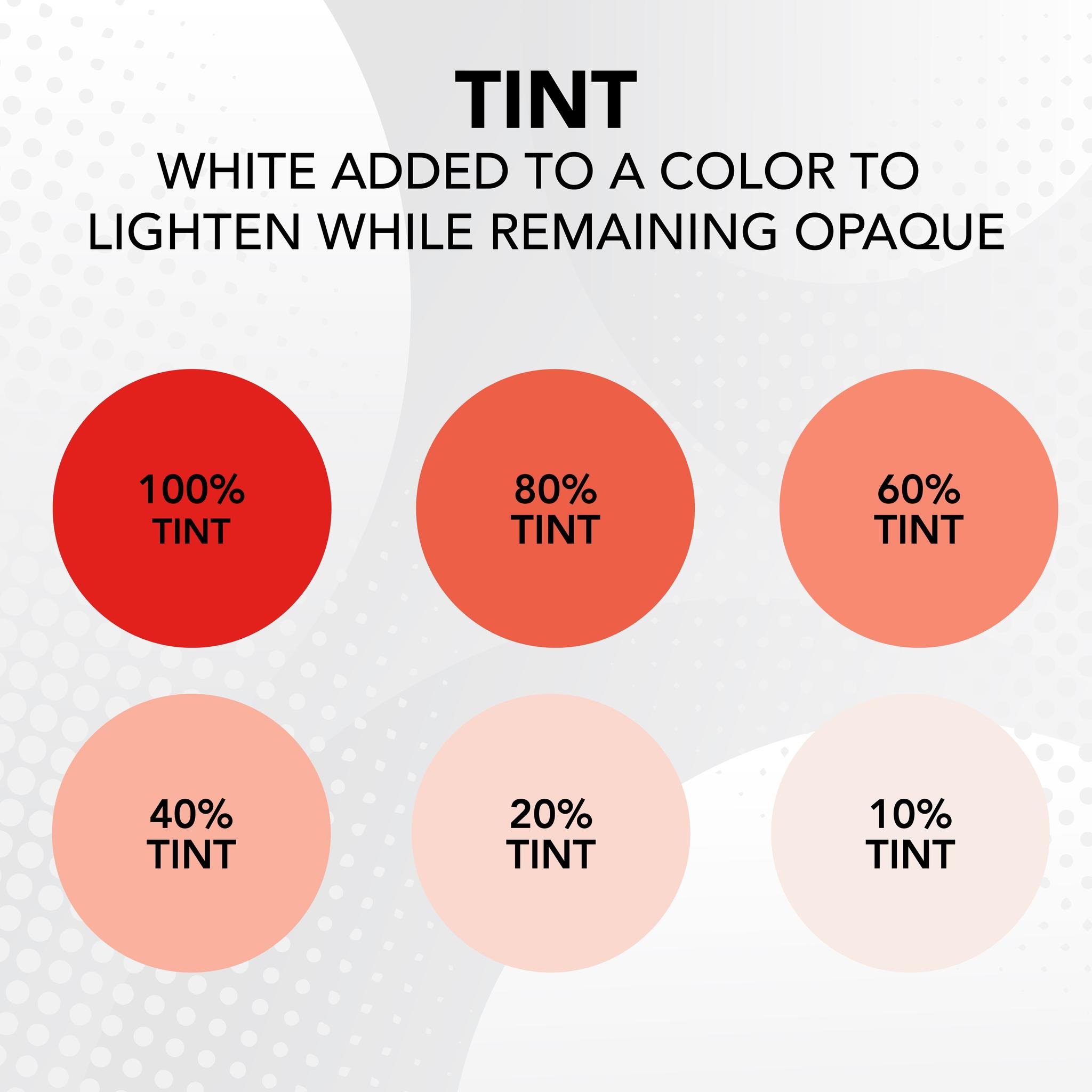
What is Tint?
Tint refers to the process of adding white to a color to make it a lighter shade. Tints often appear more muted, soft, or pastel in nature. Unlike opacity, tinting does not reduce an element's opaqueness, so objects in the background do not show through. Check out our tint level chart for a visual representation.
Uses of tint in design: When it comes to design, tints are commonly used to create color variation. Applying slight tints can emphasize specific design elements while working with a consistent color palette. For example, a designer might choose to tint a heading or call-to-action button to accentuate it within a layout. Overall, tints are a creative way to create visually interesting designs that maintain a sense of cohesiveness and harmony.

The importance in Designing for Print
When it comes to designing for print, it’s important to know the difference between opacity and tint and how each will impact the visual appearance of your product. Objects with opacity will appear transparent in print pieces, resulting in overlapping colors and layering effects. Meanwhile, tinted objects are great for creating subtle color variations that will print as opaque colors and “knock out” colors or elements in the background. Need a visual representation? Check out our tint vs opacity comparison diagram..
In summary, both opacity and tint are powerful elements in the world of graphics, and comprehending the distinction between the two is crucial for making informed design decisions. So, whether it’s crafting web interfaces that captivate or print pieces that stand as tangible masterpieces, understanding the proper use of opacity and tint opens the doors to limitless possibilities, illuminating the path toward design excellence.